library(ggplot2)
library(dplyr)
library(tidyr)

plot_salary <- function(data_file, prof){
    tab = read.csv(data_file, header = T)
    tab = tab %>% pivot_longer(names_to = "Salary", values_to = "value", cols = 3:5)
    img = tab %>%
        ggplot(aes(x = reorder(Country, value), y = value / 12)) +
        geom_point() +
        geom_smooth(aes(x = as.numeric(as.factor(reorder(Country, value))), color = Salary), se = F) +
        geom_hline(yintercept = mean(tab$value) / 12, colour = "orange", linetype = "longdash") +
        ylim(0, 12000) +
        theme_classic() + labs(y="USD / month (Gross Salary)", x = "Countries",
                                title = prof) +
        theme(axis.text.x = element_text(angle = 45, hjust = 1, size = 12),
                axis.title = element_text(size = 20),
                title = element_text(size = 20),
                legend.position = "none")
    print(mean(tab$value/12))
    return(img)
}


# This is how table would look like:
# Country,Title,Min Salary (USD),Avg Salary (USD),Max Salary (USD)
# United Kingdom,Postdoc,32000,42000,52000
# Germany,Postdoc,38000,48000,58000
# France,Postdoc,33000,43000,53000
# ....

bioinfo_file <- "../../data/salaries_bioinfo_table.csv"
png(filename = "Bioinfo_USD_h.png", res = 300, width = 3000, height = 2000)
plot_salary(bioinfo_file, "Bioinfoinformatician")
dev.off()

postdoc_file <- "../../data/salaries_post_table.csv"
png(filename = "PostDoc_USD_h.png", res = 300, width = 3000, height = 2000)
plot_salary(postdoc_file, "Postdoc")
dev.off()

soft_file <- "../../data/salaries_sd_table.csv"
png(filename = "Soft_USD_h.png", res = 300, width = 3000, height = 2000)
plot_salary(soft_file, "Software Developer")
dev.off()

soft_file <- "../../data/salaries_da_table.csv"
png(filename = "DA_USD_h.png", res = 300, width = 3000, height = 2000)
plot_salary(soft_file, "Data Analyst")
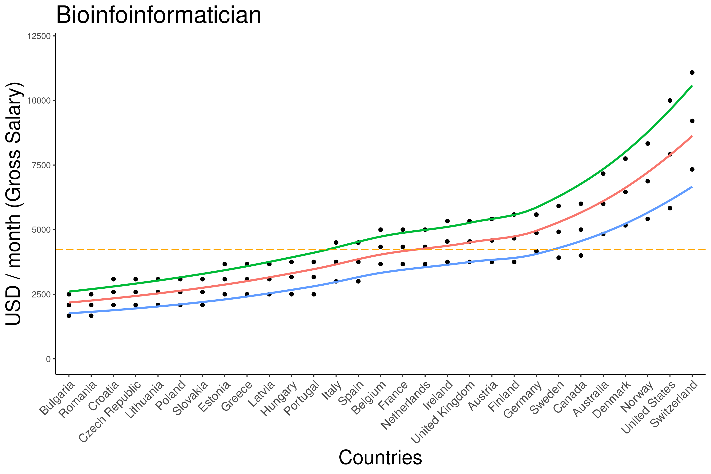
dev.off()Some time ago, I became curious about the gross salary range for bioinformaticians across various countries in Europe and North America. While browsing through platforms like Glassdoor and Indeed seemed exhaustive, I opted to try ChatGPT for insights. After obtaining data from ChatGPT, I chose to convert the yearly gross salary into a month rate, considering a standard work year of 12 months. After this was just some plotting with ggplot2. These are the results I discovered.

ChatGPT have found an overall average of ~4250 USD/ month (Annualy: 51000 USD or 26 USD/h). This does not take into account bonuses and benefits.
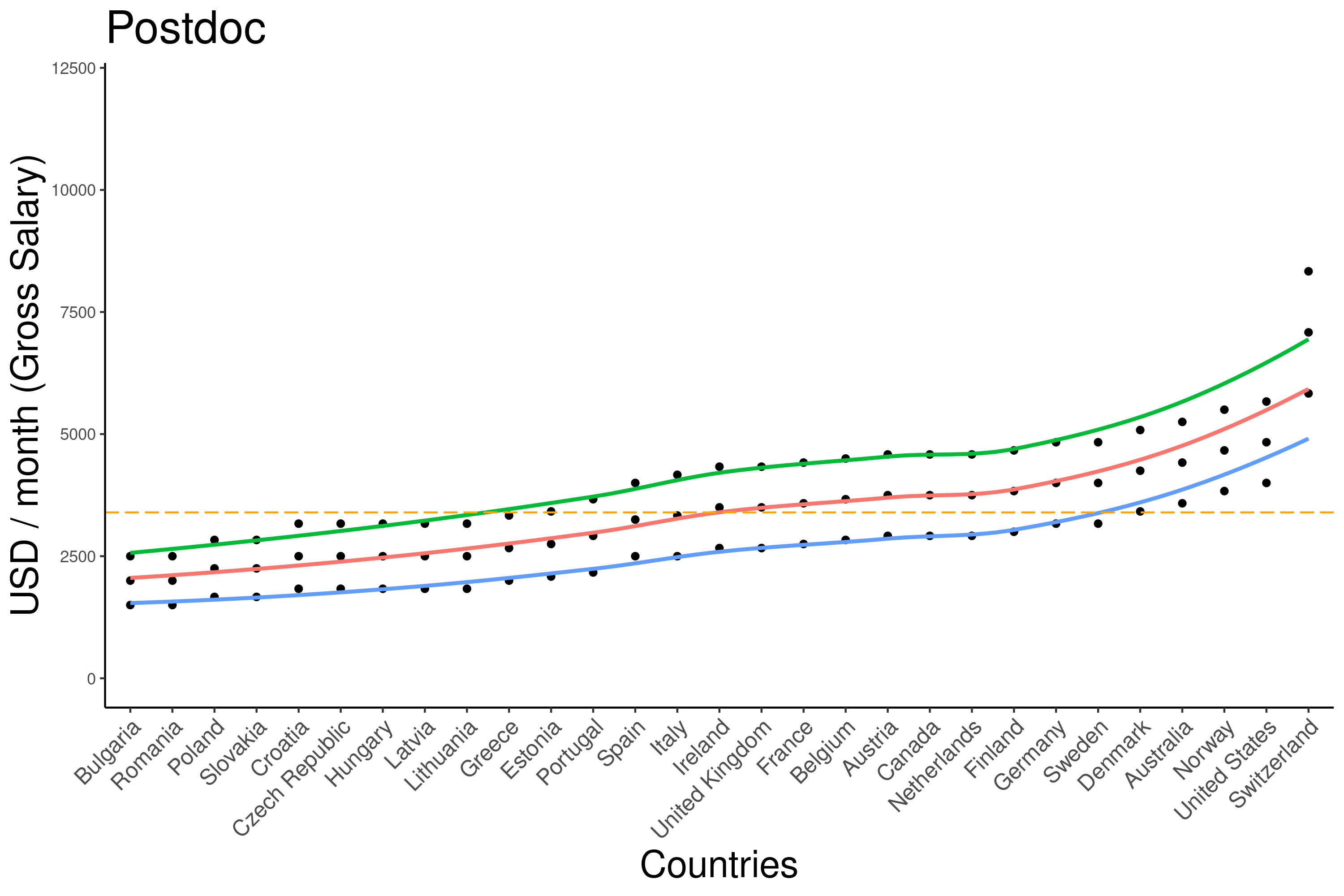
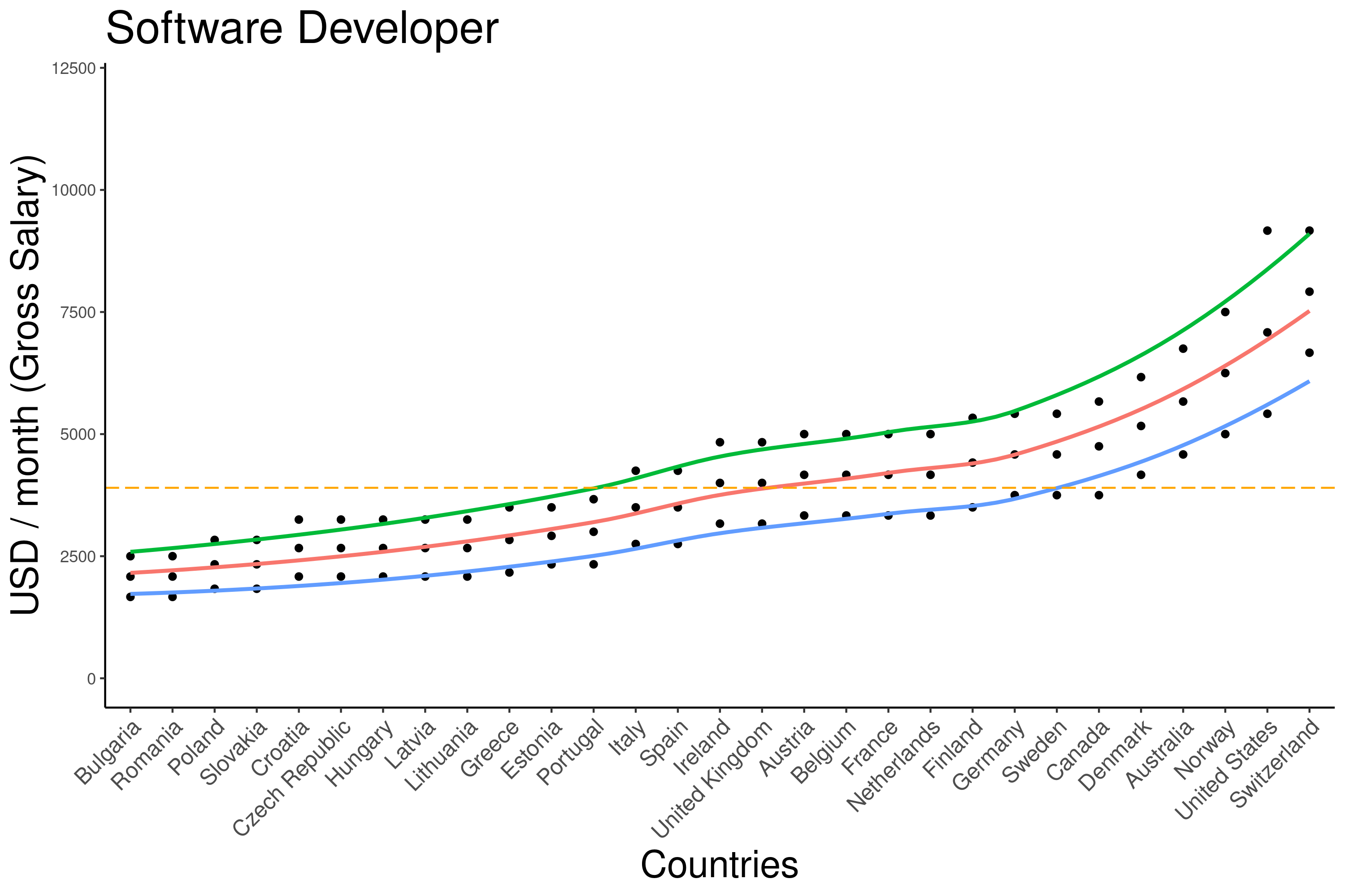
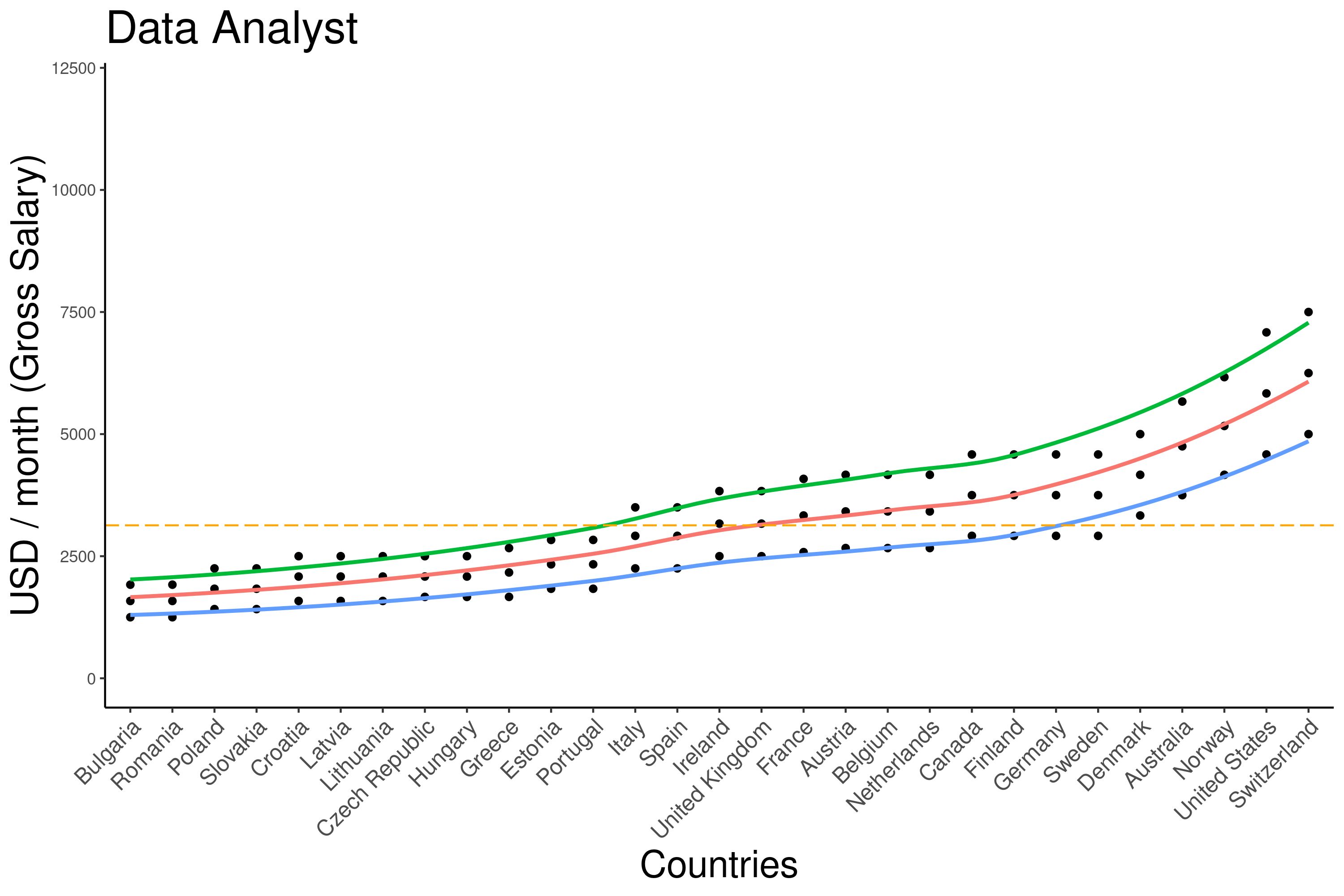
Also asked same for software developer, post doctoral position and data analyst.


Those plots might not be a full picture but give us a hint of how Bioinformatics is doing in IT world.
If you are also interested in how I did this plot, you can find it below: